Categories
Content Analysis Data Recognition Interpretation

Reflections on quantified data: #ScholarStrike in the context of COVID-19

Although the COVID-19 pandemic created a truly shared global context for the first time in years, it soon began to coexist with the local reality of each country. Twitter, as expected, was no stranger to this, and certain hashtags soon began to appear that account for this “localization” process of the pandemic (for example, in Argentina, #coronacrisis, in reference to the financial collapse as a result of a long lockdown and a weak economy inherited from the previous government). However, other hashtags less representative of the public health situation soon began to become resignified, and even to emerge, within this context. For the United States, this was the case for #BlackLivesMatter and #ScholarStrike.

In this post we seek to look into the particularities of the latter, following the analysis that we proposed in our previous post (“What can academic journals tell us about COVID-19 and Education?”), that is, to use quantitative analysis platforms (in the previous post we used AVOBMAT) developed by third parties to perform a text mining analysis, while evaluating the functionalities and limitations of the tool. The case of #ScholarStrike seemed ideal to analyze with a “tailor-made” tool, since it is a hashtag that had a strong presence for a limited time (prior to the initiative, during it and a few days after).

For those unaware of the news from the U.S., Scholar Strike was an action and teach-in at the universities that sought to recognize and raise awareness of the increasing number of deaths of African Americans and other minorities due to the excessive use of violence and force by the American police. For two days, between September 8 and 9, professors, university staff, students and even administrators walked away from their regular duties and classes to participate in classes (in some cases open) on racial injustice, police surveillance and racism in United States. Canadian universities held their own Scholar Strike between September 9 and 10. At the Scholar Strike official site it is possible find more information on the actions, as well as on their YouTube channel, where different scholars posted examples of teach-ins and other resources. The official site also includes a list of textual and audiovisual resources that could be used in the classes as well as information on the media coverage of the Scholar Strike. Scholar Strike Canada also created an official website which includes details of the programmed activities, resources, and links to the organizations that supported the initiative.

 Our goal was to perform a text mining analysis on this hashtag, while also looking for terminological coincidences with others directly related, such as #BlackLivesMatter, and with some more connected to the COVID-19 crisis.

To do this, we used two commercial Twitter text mining platforms: Brand24 and Audiense. Brand24’s official site (https://brand24.com/ ) describes the platform as a “web and social media monitoring tool with powerful analytics”. The tool looks for keywords provided by the user and analyzes them on different levels. It is mostly oriented towards brands analysis and the use of the data in digital marketing. On the other hand, Audiense (https://audiense.com/ ) as it’s described on its official page, “provides detailed insights about any audience to drive your social marketing strategy with actionable and enriched real-time data to deliver genuine business results”. It is worth stressing, as it is clear from the official descriptions of the tools, that both have been developed to be used in business, although they can be adapted, of course, to any type of research on social media.

The work with these platforms is almost completely opposite to what we have been doing in this project. If in the interaction with our database, we establish a process of filtering and curating the data, to then proceed to the analysis through different tools and methods (terms frequency, topic modeling), here the filters that we can give to the platform are few (we can choose the social media platform, and set up the date range). It is the platform itself that produces a series of daily results that are also interpreted in an automatic analysis in the form of percentages, visualizations and infographics.

We used Brand24 and Audiense in their 7-day trial version. Broadly speaking, in comparison, Brand24 is quite superior to Audiense. We performed the same searches and the first thing we noticed was that Audiense had a high bias against the information. All the tweets that we collected via the #ScholarStrike hashtag were negative and all came from Trump supporters or the president himself.

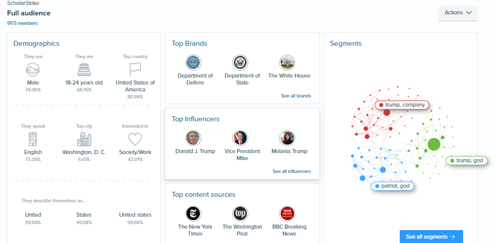
Figure 1. Audiense report on #ScholarStrike.

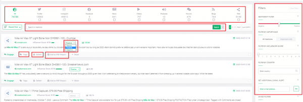
Brand24, on the other hand, returned the data in a more neutral way. As we already described, once the platform finishes performing the search, it automatically sends an email to the project admin, and the user can choose to download a report. Data can be revised in the data on the ‘Mentions’ tab, that is meant to provide the user the ability to work on the data – from direct and boolean search, through tagging, advanced filtering, deleting irrelevant mentions, to sentiment, which can be either machine assessed, or changed manually, like so:

Figure 2. Mentions Tab. Brabd 24

Now, let’s now take a deeper look on the narrative that this platform offers us for the search on #ScholarStrike.

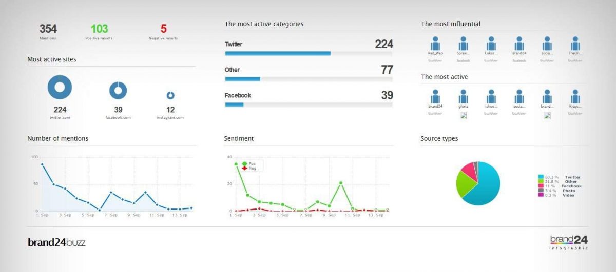
We did the first hashtag search on the 13 and Brand24 did the retrospective search for the last 30 days (Aug 14, 2020 to Sept 13, 2020). 24 hours after setting up the search, it allowed us to download a report and an infographic. In the first report, we can see that, generally, the sentiment about the strike was positive (44 positive against 21 negative):

Figure 3. Summary of #ScholarStrike mentions on social media from Brand24.

Clearly, since #ScholarStrike was an action that lasted just a couple of days, the mentions only occur in that period, but it is remarkable how they grew on the third day after it started:

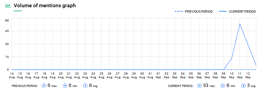
Figure 4. Graph of the volume of #ScholarStrike mentions on social media throughout the month of September.

Then, the platform gives us a visualization of the most salient terms of all social media.

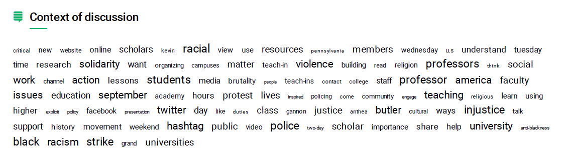
Figure 5. Set of most salient terms in social media within the context of #ScholarStrike exchange.

Justifiably, professor, teaching, are key terms since the action occurred in that field, but, as we said at the beginning of the post, the intertwine with the Black Lives Matter movement is visible in terms such as racial, issues, September, police, injustice, black. It is interesting, although expected, given its political use, that of the two most popular social network platforms, Facebook and Twitter, it is the second that stands out. Another notable term is Butler. What is interesting here is that, out of context, Butler could be associated with the philosopher and theorist Judith Butler (widely cited based on her thesis on the performativity of gender), who has also had an active intervention in the BlackLivesMatter movement through her publications in different media outlets, and on social media, as shown in these publications: https://opinionator.blogs.nytimes.com/2015/01/12/whats-wrong-with-all-lives-matter/https://iai.tv/articles/speaking-the-change-we-seek-judith-butler-performative-self-auid-1580 . However, this term actually refers to Aethna Butler, professor in Religious Studies and Africana Studies at the University of Pennsylvania, who was one of the organizers of the Scholar Strike: https://www.insightintodiversity.com/professors- lead-a-nationwide-scholar-strike-for-racial-justice /

Next, the platform shows us the most active and the most recent users in terms of their activity on Twitter:

Figure 6. Most popular users and recent mentions in Twitter.

It is difficult to know if the tool is measuring the most popular users by number of Tweets or by retweets. From what can be seen below, it seems that the calculation is made from the mentions and these are the ones that weight the degree of influence of a user on Twitter (figs 7 and 8).

However, something that struck us is the user ISASaxonists, a group of medievalists specialized in Anglo-Saxon medieval literature (fig 6).

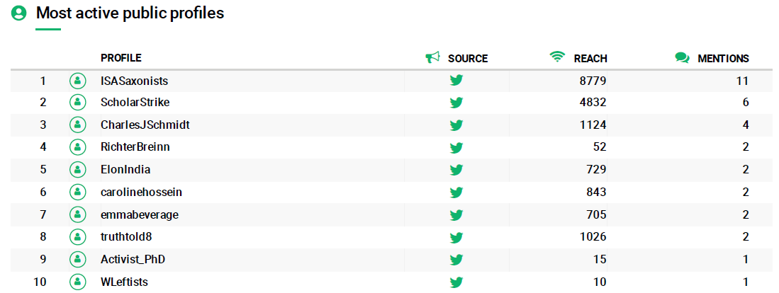
Figure 7. Most active public profiles on Twitter related to #ScholarStrike.

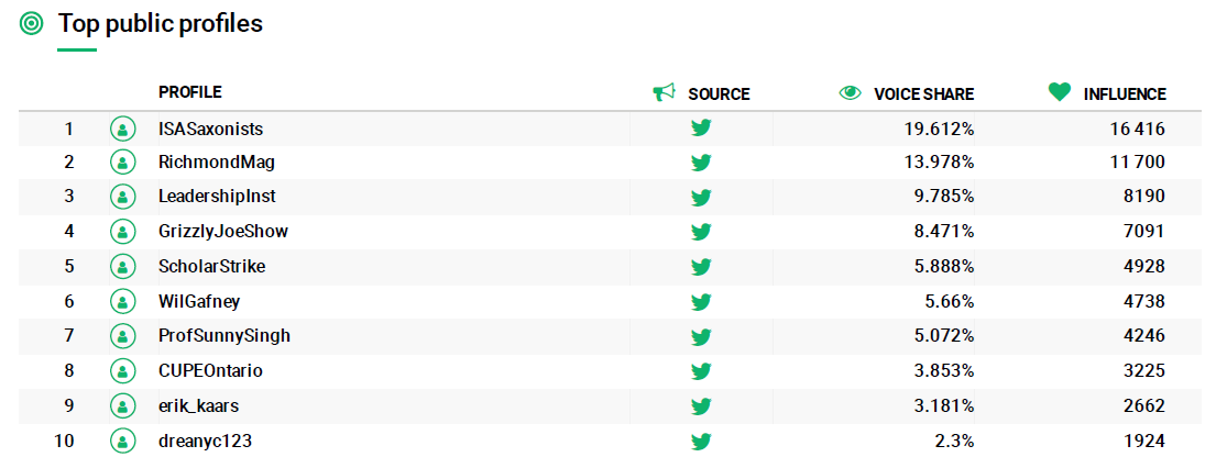
Figure 8. Most influential public profiles on Twitter.

Lastly, the platform shows the most used hashtags (and related to each other):

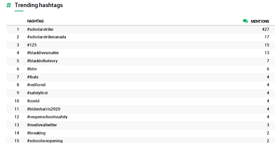
Figure 9. Most mentioned hashtags on Twitter, from the #ScholarStrike search.

#ScholarStrike, #BlackLivesMatter, #Covid are expected hashtags. Once again, the interesting thing here is the medievaltwitter hashtag, in 13th place, which, although the platform does not make it explicit, must be related, for example, to the user ISASaxonists. If this is the case, it would be interesting to think if both the medievaltwitter hashtag and the tweets of the user ISASaxonists are related to the accusations that occurred in 2019 against the Anglo-Saxon International Society for its inability to account for issue of racism, sexism, diversity and inclusion within Ango-Saxon studies. Part of this discussion was published in academic journals in the U.S during September 2019: https://www.insidehighered.com/news/2019/09/20/anglo-saxon-studies-group-says-it-will-change-its-name-amid-bigger-complaints-about

Overall, exploring the context of ScholarStrike with the Brand24 platform allowed us to confirm some previous assumptions (its relationship with hashtags such as BLM, Covid) but it also illuminated less expected other hashtags for a non-academic user, such as #medievaltwitter, and other hashtags that subtly appeared in the beginning, but soon began to have more impact in the following weeks, in the midst of the electoral race, such as #bidenharris2020.

Gimena del Rio/Marisol Fila

Categories
Análisis de contenido Reconocimiento de datos Teorización Uncategorized

Pensar los datos cuantificados: #ScholarStrike en el contexto de la COVID-19

Si bien la pandemia de COVID-19 impuso por primera vez en años un contexto global compartido, este pronto comenzó a convivir con la coyuntura local de cada país. Twitter, como es esperable, no fue ajeno a ello, y pronto comenzaron a surgir hashtags específicos que deban cuenta de ese proceso de localización de la pandemia (por ejemplo, en Argentina, #coronacrisis, en referencia al derrumbe financiero a consecuencia de una larga cuarentena y una débil economía heredada del periodo anterior). No obstante, otros hashtags menos representativos de la situación sanitaria pronto comenzaron a resignificarse, e incluso a surgir, dentro de este contexto. Para los Estados Unidos, este fue el caso de #BlackLivesMatter y #ScholarStrike.

En este post buscamos investigar en las particularidades de este último, siguiendo la línea de reflexiones que propusimos en nuestro post anterior (What can academic journals tell us about COVID-19 and Education?), es decir, utilizar plataformas de análisis cuantitativo (en el post anterior usamos AVOBMAT ) desarrolladas por terceros para realizar un ejercicio de minería de datos, a la vez que evaluamos las funcionalidades y limitaciones de la herramienta.

El caso de #ScholarStrike nos pareció ideal para trabajar con una herramienta “a medida”, ya que es un hashtag que tuvo fuerte presencia durante un tiempo acotado (previo a la iniciativa, durante la misma y algunos días posteriores). 

Para quienes no están al tanto de las noticias del Norte, Scholar Strike fue un movimiento comunitario en las universidades que buscó reconocer el creciente número de muertes de Afroamericanos y otras minorías por el uso excesivo de la violencia y la fuerza por parte de la policía. Durante dos días, del 8 al 9 de septiembre, profesores, personal universitario, estudiantes e incluso administrativos se apartaron de sus deberes y clases regulares para participar en clases (en algunos casos, abiertas) sobre la injusticia racial, la vigilancia policial y el racismo en Estados Unidos. Las universidades de Canadá realizaron su propia Scholar Strike del 9 al 10 de septiembre. En el sitio oficial del movimiento, se puede leer más sobre los fundamentos de Scholar Strike, asi como en su canal de YouTube, donde diferentes académicos colocaron clases abiertas y recursos. El sitio oficial también contiene una lista de recursos textuales y audiovisuales que pueden ser utilizados en las clases así como información sobre la cobertura de Scholar Strike en los medios. Scholar Strike Canada también creó un sitio web oficial, que incluye los detalles del programa de actividades, recursos y links a organizaciones que apoyaron la iniciativa. 

Nuestro objetivo fue hacer minería sobre este hashtag en Twitter, buscando asimismo coincidencias terminológicas con otros directamente relacionados, como #BlackLivesMatter, y con algunos más ligados a la crisis del coronavirus.

Para ello, echamos mano de dos plataformas comerciales de minería de Twitter: Brand24 y Audiense. Evidentemente, estas herramientas no son académicas, pero, como veremos mas adelante, se adaptan perfectamente al tipo de trabajo que queremos hacer con relación al análisis de datos cuantificados.

El sitio oficial de Brand24 describe a la plataforma como una “herramienta de monitoreo de redes sociales y páginas web con potentes posibilidades de análisis.”  (Brand24 is a web and social media monitoring tool with powerful analytics). La herramienta busca las palabras clave  que el usuario proporciona y las analiza en varios niveles. La herramienta está principalmente orientada para análisis de marcas y el uso de esos datos en marketing digital. Por otra parte, Audiense, según describe su página oficial, “proporciona información detallada sobre cualquier audiencia para impulsar estrategia de marketing social con datos procesables y enriquecidos en tiempo real con el fin de ofrecer resultados comerciales genuinos” . Cabe destacar, como puede verse por las descripciones oficiales de las herramientas, que ambas han sido desarrolladas para ser utilizadas en proyectos empresariales, aunque se adaptan, claro está, a cualquier tipo de búsqueda en redes sociales.

La labor con estas plataformas es radicalmente opuesta a la que venimos realizando en este proyecto. Si en la interacción con nuestra base de datos, establecemos un proceso de filtro y curaduría de los datos, para luego proceder al análisis a través de distintas herramientas y métodos (frecuencia de términos, topic modeling), aquí son pocos los filtros que podemos dar a la plataforma (elegir las redes, establecer variables de días) y es la plataforma la que arroja diariamente una serie de resultados que son asimismo interpretados en un análisis automático en la forma de porcentajes y visualizaciones e infografías.

Como decíamos, usamos las plataformas Brand24 y Audiense en su versión trial de 7 días. A grandes rasgos, comparativamente, Brand24 es una plataforma bastante superadora a Audiense. Al introducir las mismas búsquedas, lo primero que notamos fue que Audiense presenta un sesgo altísimo frente a la información. Todos los tweets que levantamos con el hashtag #ScholarStrike eran negativos. Todos provenían de seguidores de Trump o del presidente mismo.

Figura 1. Informe de Audiense sobre #ScholarStrike.

Brand24, por el contrario, arrojó los datos de una forma más neutral. Como decíamos, a la búsqueda, que automáticamente al finalizar envía un email al administrador del proyecto, le sigue la posibilidad de descarga de un informe. No se puede trabajar sobre los datos. Se cree en los datos y las infografías o se los descarta.

Veamos, a continuación, qué narrativa nos ofrece esta última plataforma para la búsqueda #ScholarStrike.

La primera búsqueda del hashtag la hicimos el día 13 y Brand24 realizó la búsqueda retrospectiva en los últimos 30 días (14 Aug 2020 – 13 Sep 2020). A las 24 horas, nos permitió la descarga de un informe y  una infografía. En el primero, podemos ver que, en términos generales, el sentimiento acerca de la huelga fue positivo (44 positivos contra 21 negativos):

Figura 2. Resumen de las menciones de #ScholarStrike en redes sociales en Brand24.

Evidentemente, al ser solo una huelga de días, las menciones solo se producen en ese periodo, pero es notable cómo crecen al tercer día de comenzada la misma:

Figura 3. Gráfico de volumen de menciones de #ScholarStrike en redes sociales a lo largo del mes de septiembre.

Luego, la plataforma nos arroja una visualización de los términos más destacados de todas las redes sociales.

Figura 4. Conjunto de términos más nombrados en redes sociales dentro del contexto de discusión de #ScholarStrike.

Con justa razón, professor, teaching, son términos clave, ya que la huelga se dio en ese ámbito, pero, como decíamos en un principio, el entrelazamiento con el movimiento Black Lives Matter es visible el términos como racial, issues, september, police, injustice, black.

Es interesante, aunque esperable, dado su uso político, que de las dos redes sociales más populares, Facebook y Twitter, es la segunda la que se destaca. Otro término destacado es Butler. Lo interesante aqui es que, fuera de contexto, Butler podria asociarse a la filósofa y teórica Judith Butler, quien ha tenido una intervención activa en el movimiento BLM,  a través de publicaciones en periódicos, y en redes sociales, y ha sido muy citada a partir de su tesis de la performatividad del género, tal y como lo muestran estas publicaciones: https://opinionator.blogs.nytimes.com/2015/01/12/whats-wrong-with-all-lives-matter/ o

https://iai.tv/articles/speaking-the-change-we-seek-judith-butler-performative-self-auid-1580. Sin embargo, este término hace referencia a Aethna Butler, profesora en estudios religiosos y estudios africanos y afro-americanos de la Universidad de Pensilvania, quien fue una de las organizadoras del Scholar Strike: https://www.insightintodiversity.com/professors-lead-a-nationwide-scholar-strike-for-racial-justice/ 

A continuación, la plataforma nos muestra los usuarios más activos y los más recientes en cuanto a su actividad en Twitter:

Figura 5. Menciones más populares y más recientes en Twitter con sus usuarios.

Resulta difícil saber si la herramienta está midiendo a los más populares por cantidad de Tweets o por retweets. Por lo que se ve en las imágenes siguientes, parece que la medición se hace a partir de las menciones y estas son las que miden el grado de influencia de un usuario en Twitter (figs 6 y 7).

No obstante, lo que más nos llama la atención es el usuario ISASaxonists, un grupo de medievalistas especialistas en lit medieval anglosajona (fig 5).

Figura 6. Perfiles públicos más activos en Twitter relacionados con #ScholarStrike.

Figura 7. Perfiles públicos más influyentes en Twitter.

En último lugar la plataforma muestra los hashtags más usados (y relacionados entre sí):

Figura 8. Hashtags más mencionados en Twitter, a partir de la búsqueda #ScholarStrike.

#ScholarStrike, #BlackLivesMatter, #covid son hashtags esperables. Una vez más, lo interesante aquí es el hashtag medievaltwitter, en 13 lugar, que, aunque la plataforma no lo explicita, debe estar relacionado, por ejemplo, con usuario ISASaxonists. De ser el caso, sería interesante pensar si tanto el hashtag medievaltwitter como los tweets del usuario ISASaxonists están relacionados con las acusaciones que ocurrieron en 2019 a la Sociedad Internacional Anglo-Sajona por su inhabilidad de dar cuenta de problemas de racismo, sexismo, diversidad e inclusión dentro de la misma. Parte de esta discusión fue publicada en revistas académicas en Estados Unidos durante septiembre de 2019:

https://www.insidehighered.com/news/2019/09/20/anglo-saxon-studies-group-says-it-will-change-its-name-amid-bigger-complaints-about.

En conclusión, explorar el contexto de #ScholarStrike con la plataform Brand24 nos permitió constatar algunas suposiciones previas (su relación con hashtags como BLM, Covid) pero iluminó otros hashtags menos esperables para un usuario no académico, como #medievaltwitter, y otros que aparecían tímidamente, pero pronto comenzaron a tener más impacto semanas siguientes, con la carrera electoral, como #bidenharris2020.

Gimena del Rio  / Marisol Fila

Categories
Análisis de contenido Teorización Visualización

¿Qué pueden decirnos las publicaciones académicas sobre el COVID-19 y la Educación?

La aparición del coronavirus ha puesto en nuestro lenguaje cotidiano nuevos términos, como pandemia o infodemia. Este último, de acuerdo a Wikipedia, puede ser definido como: 

“El término infodemia se emplea para referirse a la sobreabundancia de información (ya sea rigurosa o falsa) sobre un tema concreto, como por ejemplo en el caso del coronavirus​. El término se deriva de la unión entre la palabra información y la palabra epidemia. Se relaciona con conceptos similares como fake news o infoxicación, en la medida que la cantidad y exposición de éstos se intensifican.”

Una buena forma de sobrevivir a la infodemia es analizar datos. AVOBMAT (Análisis y visualización de metadatos y textos bibliográficos / Analysis and Visualization of Bibliographic Metadata and Texts – https://avobmat.hu/) es una herramienta de investigación de minería de datos que se diseñó principalmente para la investigación en humanidades digitales. Es un poderoso kit de herramientas digitales para analizar y visualizar metadatos y textos bibliográficos. AVOBMAT agregó un conjunto de datos sobre COVID-19 a su nueva herramienta de investigación de minería de textos. Es un recurso de más de 138,000 artículos académicos (lamentablemente, solo en inglés), que incluye más de 69,000 artículos completos, sobre COVID-19, SARS-CoV-2 y coronavirus relacionados. Pensamos que antes de profundizar en el vasto océano de Twitter para ver qué está sucediendo en relación con la pandemia y la educación (educación superior/universitaria, enseñanza remota/a distancia), debemos construir un marco de referencia que pueda apoyar e informar nuestra hipótesis. Utilizamos AVOBMAT para explorar lo que las publicaciones científicas publicaron entre 2019 y  2020 sobre estos temas.

Primero, hicimos una búsqueda general con Lucene: establecimos un período (2019 y 2020) y elegimos algunas palabras generales como “programa de estudios”, “educación” y “coronavirus” (no solo COVID-19, sino todas las enfermedades por coronavirus). La búsqueda nos mostró 298 artículos (por supuesto, todos en inglés): http://dighum.bibl.u-szeged.hu/avobmat-covid/home

Luego, pensamos qué podría decirnos esta búsqueda general en un enfoque más cercano y detallado, aunque aún distante. Elegimos la opción de visualización de WordCloud y este fue el resultado:

Nube de palabras en AVOBMAT

Algo que casi esperábamos, pero que la nube confirmó es la referencia a ciudades y países (Wuhan, Hubei, China, Vellingiri) y a meses específicos (diciembre, febrero, marzo). Teniendo en cuenta que Estados Unidos entró en una situación más crítica en abril, descubrimos la presencia del Oriente. Sin embargo, esto también abre una pregunta sobre otros países como Italia o España e incluso el Reino Unido, donde se estaban pasando por momentos críticos a principios de 2020. Podemos explicar estos resultados argumentando la lenta respuesta de la producción y publicación académica al abordar este nuevo contexto, pero quizás también con un interés no tan alto en los temas que estábamos buscando (programa de estudios, educación, coronavirus).

Sin embargo, la explicación en sí está en el coronavirus, como el SARS-CoV (2002-2003) y el MERS-CoV (2012-hasta el presente). Todos los otros coronavirus atacaron principalmente a países del Este y no del Oeste. Esto explica la presencia en la nube de algunas de las ciudades que mencionamos anteriormente. En realidad, no fue sino hasta marzo de 2020 que algunas revistas sobre educación superior estadounidenses, como Inside Higher Ed y The Chronicle of Higher Ed, comenzaron a publicar artículos que hablaban sobre Covid-19 y educación superior en los Estados Unidos. Publicaciones anteriores del 2020 o incluso en enero y febrero de 2020 hablaban sobre nuevos desafíos en la educación universitaria en China, Corea del Sur o Europa (Italia, España, Reino Unido) (Véase, por ejemplo, la búsqueda que hicimos para la revista Inside Higher Ed)

En definitiva, es realmente interesante que la educación esté en esta nube relacionada con la medicina (atención médica, farmacéuticos, emergencias, cuarentena, transmisión) y, obviamente, con cara, máscara … y Google. Por supuesto, no es solo el cuerpo físico presente aquí sino también términos interesantes como psiquiatra, mental, etc.

Uso y contexto del término educación

Pero finalmente, si hacemos una lectura muy cercana y analizamos los metadatos que obtuvimos en la búsqueda general, podemos encontrar en los artículos que, la mayoría de las veces, el término educación está relacionado con las variables que los investigadores usan para estudiar la enfermedad. Por ejemplo, este es un pasaje en el artículo “A County-level Dataset for Informing the United States’ Response to COVID-19” (“Un conjunto de datos a nivel de condado para informar la respuesta de los Estados Unidos a COVID-19”) por Benjamin D. Killeen et al (2020), en el que los autores afirman que han utilizado “300 variables que resumen las estimaciones de población, demografía, etnia, vivienda, educación, empleo e ingresos, clima, puntajes de tránsito y métricas relacionadas con el sistema de salud ” (“300 variables that summarize population estimates, demographics, ethnicity, housing, education, employment and income, climate, transit scores, and healthcare system-related metrics.” – https://arxiv.org/pdf/2004.00756.pdf)

En otros casos, el término educación está muy relacionado con un Ministerio (en el caso de Irán, el trabajo del Ministerio de Salud y Educación Médica es muy citado (https://www.ncbi.nlm.nih.gov/pmc/articles/PMC7085938/)

Visualización de revistas académicas que contienen los términos de búsqueda en sus artículos

Por lo tanto, no es fácil entender lo que nos dice esta nube.

Si hacemos una consulta similar con Lucene pero reemplazamos coronavirus con Covid-19, más educación y programa de estudios, encontramos 458 artículos que nos muestran estas palabras:

Nube de palabras con AVOBMAT

Por supuesto, las ciudades (Hubei, Wuhan, China) y los meses (enero, febrero, marzo) todavía están allí. Vemos términos relacionados con enfermedades mentales (psiquiatra, mental), pero la cuarentena ahora comparte semántica con un sinónimo que se ha utilizado ampliamente en los países anglófonos: el encierro (lockdown). Y también tenemos palabras familiares para Google (por ejemplo, Internet) y las nuevas incorporaciones, como Whatsapp, y otros términos relacionados con nuestra nueva vida, como en línea, a distancia y telemedicina.

Sin embargo, ¿qué pasa con la educación, entendida como la enseñanza y el aprendizaje? Detallamos un poco más nuestra búsqueda usando términos como enseñanza, universidades, aprendizaje, estudiantes y COVID-19. Como resultado, obtuvimos 199 artículos en los que estas fueron las palabras más utilizadas:

Nube de palabras con AVOBMAT

El encuentro versus el encierro, moodle, moocs, distancia, los gimnasios nos dieron una imagen muy realista del escenario educativo en estos días. Incluso la visualización de metadatos nos dice que estos temas se abordan desde las Ciencias Médicas, y nos da una imagen detallada de nuestra situación global con el  COVID-19.

Visualización de revistas académicas que contienen los términos de búsqueda en sus artículos

Como sospechábamos, la mayoría de los artículos publicados sobre COVID-19 y los diferentes enfoques sobre temas relacionados con la educación, la educación superior y universitaria, etc., están relacionados con estudios en las ciencias médicas. Por un lado, como se esperaba, esta es una disciplina dominante en un contexto de pandemia, pero también muestra cómo las Ciencias Médicas han mejorado el lento tiempo de la escritura académica. Por supuesto, nos damos cuenta de todas las publicaciones sobre este tema, ya que muchos servicios de recolección de otras latitudes no están incluidos como parte del servicio AVOBMAT. Sin embargo, nos da una idea general para avanzar en nuestro próximo post a un enfoque sobre lo que los tweets dicen sobre estos temas. ¡En breve, más análisis cercano y distante!

Marisol Fila y Gimena del Rio Riande

Categories
Theorizing visualization

What can academic journals tell us about COVID-19 and Education?

The Covid situation has put new terms into our everyday vocabulary, terms such as pandemic or infodemic. This last one, according to Wiktionary can be defined as:

Blend of information +‎ epidemic

Noun

infodemic (plural infodemics)

  1. (informal) An excessive amount of information concerning a problem such that the solution is made more difficult.
  2. (informal) A wide and rapid spread of misinformation.

One good way of surviving infodemia is analyzing data. AVOBMAT (Analysis and Visualization of Bibliographic Metadata and Texts-https://avobmat.hu/) is a text mining research tool that was primarily designed for digital humanities research. It is a powerful digital toolkit for analysing and visualizing bibliographic metadata and texts. AVOBMAT added a COVID-19 dataset to its new text mining research tool. This is a resource of over 138,000 scholarly articles (sadly, only in English), including over 69,000 with full text, regarding COVID-19, SARS-CoV-2, and related coronaviruses. We thought that before delving into the sea of Twitter to see what is happening in relation to the pandemia and Education (Higher Ed, Remote Teaching, etc.), we should build a framework that could support and inform our hypothesis. We used AVOBMAT to explore what scientific journals published between 2019 and 2020 regarding these topics.

First, we did a General Lucene query: we set up a period (2019 and 2020) and chose some general words such as “syllabus”, “education” and “Coronavirus” (not only COVID-19, but all the Coronavirus diseases). The search showed us 298 articles (of course, all of them in English): http://dighum.bibl.u-szeged.hu/avobmat-covid/home

Then, we chose to see what this general search could tell us in a closer approach, though still distant. We chose the WordCloud visualization option, and this was the result:

WordCloud in AVOBMAT

Something  we generally expected, then had confirmed by the cloud, are the references to cities and countries (Wuhan, Hubei, China, Vellingiri) and references to specific months (December, February, March). As the situation in the US was not critical until April, we discovered the presence of the East. However, it is curious that other countries such as Italy, Spain, and the United Kingdom, all of which were in a concerning situation through early 2020, were missing. We could explain these results with an argument that there was a delayed response in academic writing and publishing in tackling this new context, and maybe also that there was not much interest in the topics we were looking at (syllabus, education, coronavirus). However, the explanation itself is in the coronavirus, specifically SARS-CoV (2002-2003) and MERS-CoV (2012-nowadays). All of the other coronaviruses mainly attacked countries from the East and not the West. This explains the appearance of some of the cities that we mentioned before. Actually, it wasn’t until March 2020 that some journals, such as Inside Higher Ed and The Chronicle of Higher Ed, started publishing articles that talked about Covid-19 and Higher Ed in the US. Earlier publications from 2020 or even January and February 2020 were talking about new challenges in Higher Ed in China, South Korea or Europe (Italy, Spain, UK) (See for instance the search we did for Inside Higher Ed journal).

All in all, it is really interesting that in this cloud education is related with medicine (healthcare, pharmacists, emergency, quarantine, transmission) and, obviously with face, mask…and Google. Of course, it is not only bodily medicine referred to here, but also terms such as psychiatrist, mental, etc.

Keyword in Context (KWIC) in AVOBMAT. Education.

Finally, if we do a very close reading and analyze the metadata given in the general search, we find that in most of the articles the term education is related to the variables that the researchers used to study the disease. For instance, this is a passage in “A County-level Dataset for Informing the United States’ Response to COVID-19” by Benjamin D. Killeen et al (2020), in which the authors state that they have used “300 variables that summarize population estimates, demographics, ethnicity, housing, education, employment and income, climate, transit scores, and healthcare system-related metrics.”(https://arxiv.org/pdf/2004.00756.pdf). In other cases, the term education is very much related to a Ministry (in the case of Iran, the work of the Ministry of Health and Medical Education is much cited (https://www.ncbi.nlm.nih.gov/pmc/articles/PMC7085938/).

Journals visualization in AVOBMAT

Therefore, it’s not easy to understand what this cloud is telling us. 

If we do a similar Lucene query but replacing Coronavirus with Covid-19, plus education and syllabus, we find 458 articles that show us these words:

WordCloud in AVOBMAT

Of course places (Hubei, Wuhan, China) and months (January, February, March) are still there. Terms related to mental illnesses are there (psychiatrist, mental), but quarantine now has a synonym which has been widely used in anglophone countries: lockdown. We also have words similar to Google (for example, Internet), and newcomers such as  Whatsapp and others related to our new  life, such as online, distance and telemedicine.

But what about education, as teaching and learning? We further detailed our search using terms such as teaching, universities, learning, students and COVID-19. As a result, we got 199 articles in which these were the most used words:

WordCloud in AVOBMAT

Gathering versus lockdown, moodle, moocs, distance, gym, gave us a very realistic picture of the education scenario these days. Even the metadata visualization tells us that these topics are approached from the Medical Sciences, and it gives us a detailed picture of our global COVID-19 situation.

Journal visualization in AVOBMAT

As we suspected, most of the articles published about COVID-19 and the different approaches to topics related to education, Higher Education, etc. are related to studies in the  Medical Sciences. On the one hand, as expected, this is a dominant discipline in a pandemic context, but it also shows how Medical Sciences have improved the slow timing of academic writing. Of course, we are not giving account of all the publications on this topics, as many harvesting services from other latitudes are not included as part of the AVOBMAT service. Nevertheless, it gives us the big picture to move in our next post to an approach of what the tweets are saying on these topics. More distant and close reading coming soon!

Marisol Fila and Gimena del Rio Riande

Categories
Content Analysis Curricula Visualization

COVID-19 and Higher Ed. A Look From the Digital Humanities

The 2020 opened with the news of a new disease. In a couple of weeks it became a global pandemic and we have all been concerned with this topic since then. Higher education is not exempt of it and in the last few months, we have seen how discussions on the pandemic have reached the syllabi.

From Humanities to Sciences, all disciplines are having discussions on causes, local and global consequences, history, politics… all about COVID-19. Aligned with the spirit of our project, we believe that Digital Humanities can help us to grasp what, how, and where these topics are discussed in Higher Ed.

Over the next few months, we will be posting some analysis and visualizations on the way syllabi are reacting to the global pandemic, and under which perspectives. Since we are relying on sources that have been made publicly available, our initial corpus will be composed by syllabi from the US, but we aim to open it up to Latin America as new material comes up. Stay tuned!

Undergraduate Course Syllabi | National Communication Association
Categories
Análisis de contenido Curricula Visualización

COVID-19 y educación superior. Una mirada desde las HD

El 2020 comenzó con la noticia sobre un nuevo virus. En unas semanas se convirtió en pandemia global y desde entonces todos hemos estado preocupado por este tema. La Educación Superior no quedó al margen y en los últimos meses, hemos visto cómo las discusiones sobre la pandemia han llegado incluso a los programas de estudios.

Desde las Humanidades hasta las Ciencias, todas las disciplinas están discutiendo sobre causas, consecuencias locales y globales, historia, política… todo con relación a la COVID-19. En línea con el espíritu de nuestro proyecto, creemos que las Humanidades Digitales pueden ayudarnos a comprender qué, cómo y dónde se discuten estos temas en la Educación Superior.

En los próximos meses, iremos publicando análisis y visualizaciones sobre la forma en la que los programas de estudio han ido reaccionando ante la pandemia global y bajo qué perspectivas. Dado que nos basamos en fuentes que se han puesto a disposición del público, nuestro corpus inicial estará compuesto por programas de estudio de los EE. UU., pero nuestro objetivo es abrirlo a América Latina a medida que surja nuevo material. ¡Estén atentos!

Categories
Humanidades Digitales Organización Preservación

Recursos del proyecto

Te interesa saber más o colaborar con nuestro proyecto?

Nuestra plataforma de divulgación será este sitio web creado con WordPress y alojado en la University of Miami donde publicaremos recursos sobre la Covid-19 desde una perspectiva humanística y lingüística y documentaremos nuestro trabajo.

Todos los datos del proyecto se almacenan en nuestro repositorio en Github, proporcionando una lista de datos relacionados con la pandemia, y un corpus bilingüe de Twitter en inglés y español, especialmente enfocado en el área del sur de Florida y Miami. También usamos GitHub para documentar el desarrollo del proyecto y escribimos entradas en nuestro blog sobre el trabajo realizado.

Asimismo, tenemos una biblioteca en Zotero, donde puede unirse y agregar cualquier lectura que considere interesante.

Encuentras nuestros tweets bajo el hashtag #DHCOVID

Categories
Investigación Lenguaje Proyectos

Hola Mundo

Las Humanidades Digitales pueden ayudarnos a comprender los datos desde una perspectiva humanista, y parece particularmente acertado en estos momentos, en el que los datos sobre la Covid-19 están en todas partes y se están generando en masa. Los datos generados al interno de un contexto social, humanístico y humano necesitan ser analizados críticamente. Narrativas Digitales de Covid-19 (DHCOVID) explorará durante un año (mayo de 2020-2021) las narrativas existentes detrás de los datos sobre la pandemia del coronavirus en la literatura académica y las redes sociales utilizando enfoques cuantitativos y cualitativos de las HD.

DHCOVID es un proyecto bilingüe, a partir de datos en inglés y español, que reúne a académicos de la Universidad de Miami (EE. UU.) y del CONICET (Argentina). El proyecto, además, está abierto a todo tipo de colaboraciones y a investigadores colaborativas en el ámbito de las Humanidades Digitales o de cualquier otra disciplina interesada en los datos de la Covid-19.

El proyecto ha sido financiado por el College of Arts and Sciences de la Universidad de Miami.

Actualizaremos este sitio con posts sobre nuestras investigaciones y también difundiremos las noticias en Twitter (#DHCOVID). ¡Gracias por participar en el proyecto!

Categories
Digital Humanities Organizing Preservation

Project resources

Interested in knowing more or collaborating with our project?

Our main platform is this WordPress site hosted at the University of Miami where we will be posting resources on Covid-19 data, from a humanistic and linguistic perspective, and documenting our work.

All our data are stored in our repository in Github, providing in the near future a list of datasets related to the pandemic, and a bilingual Twitter corpus in English and Spanish, especially focused on the South Florida area and Miami. We also use GitHub to document the development of the project, and we write blog posts about our work in our site.

We also have a Zotero library, where you can join us and add any reading you might find interesting.

Also, all our tweets are under #DHCOVID

Categories
Language Projects Research

Hello, world

Digital Humanities can help us understand data from a humanistic perspective, and this seems particularly true in this time, in which data about Covid-19 seems to be everywhere and overwhelmingly generated in large volumes. Data in a social, humanistic and human context need to be critically analyzed. Digital Narratives of Covid-19 (DHCOVID) will explore during one year (May 2020-2021) the narratives behind the data about coronavirus pandemia in academic literature and social networks using quantitative and qualitative DH approaches.

DHCOVID is a bilingual project, it focuses on data in English and Spanish, and brings togethers scholars from the University of Miami (USA) and CONICET (Argentina). However, the project is open to collaboration and co-working with researchers from Digital Humanities or any discipline interested in Covid-19 data.

The project has been funded by the College of Arts and Sciences at the University of Miami.

We will update this site with posts about our research and also disseminate the news on Twitter (#DHCOVID). Thanks for joining us!