Categories
Cleanup Methods Visualization

Outbreak Topics: Topic modeling of COVID-19

In this post, we will present another way to explore our dataset of tweets on Covid-19. We intend to detect emerging topics of interest for our study of the social narratives about the pandemic. For this, we will perform unsupervised machine learning using different Python libraries.

In this case, we work with data in Spanish, but the same processing can be applied to English data; only a few parameters will diverge.

“Cleaning is usually 80% of a data scientist’s time”

Working with big data usually involves spending most of the time cleaning and organizing the data (source). This case is no exception! Cleaning is crucial for text processing not only because it reduces a text making it easier to read by machine, but also because it can significantly improve the quality of the results.

Our first step is to filter stopwords and emojis. We used generic lists available in standard libraries (NLTK, emoji). Based on the results, we refresh the list of stopwords to eliminate noise (e.g., “retwitt”) or words that are too obvious (e.g., “covid19”).

Another important step of preprocessing is part of speech detection and lemmatization. We chose to use Stanza (from Stanford NLP) because it yields better results for Spanish lemmatization. Spacy could be a better choice for English, since it obtains good results with reduced morphology languages such as English. The processing time is also notably faster than with Stanza.

After preprocessing, we can tackle detection of the main topics of our Covid-19 corpus with machine learning using Gensim, a Python library for topic modeling. We will perform an unsupervised learning because we don’t know the content or quantity of our topics in advance. Then, we will train our models with LDA for 3 to 30 topics.

Topic coherence of the models measured with c_npmi, c_uci and u_mass for all the tweets in Spanish on April 25th

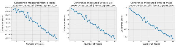
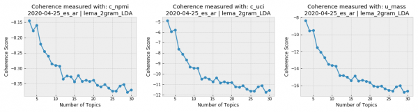
The topic coherence plots generated for the Spanish-language tweets from April 25th show that the conversation in our Covid-19 corpus was very focused, since the coherence drastically falls when the topic number grows. Given the opposite case (when topic coherence scores better for more topics), it is important to find an agreement between the results of the coherence scores and the number of topics interpretable by humans. It is hard to imagine a human analysis dealing with over a dozen topics for the same corpus.

Visualizing the results with graphics is very helpful for the analysis. A popular library for visualizing topic models is pyLDAvis, which shows the most frequent words of each topic in an interactive graphic.

7 topics model for all tweets in Spanish of covid19 on April 25th 2020

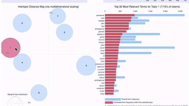
On the previous graphic, which shows seven topics for tweets from April 25th in all the locations of our sample (Argentina, Colombia, Ecuador, España, Florida, México, and Perú), we can observe the problem pointed out earlier: it becomes difficult for a human to understand the criteria used to group certain words under a certain topic. As the topic number increases, the topics are less interpretable, even if they have high coherence scores.

This problem is probably due to the size of our sample: aside from Covid-19, Twitter users of each Spanish-speaking location discuss different, largely unrelated subjects. We will compare the results for Argentina and Colombia to find out.

Topic coherence of the models measured with c_npmi, c_uci y u_mass for Argentina, best results for 3 and 5 topics
Topic coherence of the models measured with c_npmi, c_uci y u_mass for Colombia, best results for 3 and 7 topics

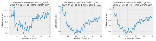
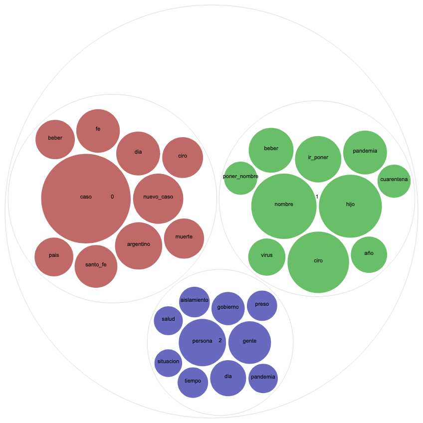
But first, a word on another type of visualization that we found very useful for topic modeling, Circle Pack. This type of graphic uses colors to represent different topics and spheres whose size is relative to word frequency. Let’s compare the Circle Pack for April 25th in Argentina and Colombia for three topics, given that both countries received high scores for this topic number.

Topics of covid19 tweets in Colombia on April 25th 2020

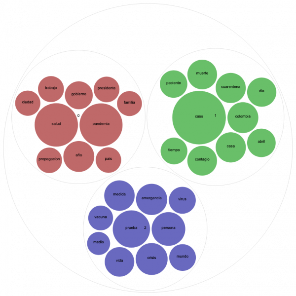
On the graphic for Colombia, the red circles represent a topic relating the pandemic to politics. It includes words as “government,” “president,” and “country”. The blue topic addresses public health issues, which includes “vaccine,” “virus,” and “test.” The green topic seems more related to daily statistics of case numbers, deaths, and infected people.

Topics of covid19 tweets in Argentina on April 25th 2020

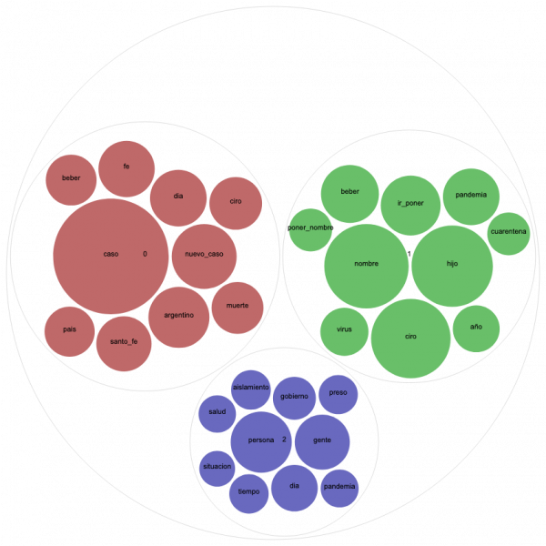
In order to interpret the Circle Pack for Argentina, it is essential to dive into the latest news of that particular day. Doing so reveals controversy surrounding a baby named Ciro Covid who was born on April 24th in Santa Fé, The question “Who would name her/his baby Ciro Covid?” that flooded Argentinian Twitter the next day is not only clearly represented on the green topic but also invaded the tweets of daily reports of case and death numbers (red topic). With a remarkably smaller dimension, we can observe another trending topic in Argentina that day: the controversy of inmates leaving on probation as a preventative measure, represented in blue.

Once again, we confirm that the humanist approach of understanding data and its contexts is critical for assigning a meaning to the results of automatic processing.

For more details about the processing performed for topic modeling, download the notebook available on our project Github repository.

Categories
Content Analysis Visualization

Analyzing a Twitter Corpus with Voyant (I)

The first step of working with data is to get to know your corpus. Our project, for instance, is most concerned with the linguistic and humanistic contexts in the Twitter discourses generated by the Covid-19 pandemic. Some starting “get-to-know-you” questions we are interested in about our corpus include the trend of daily corpus length, most frequently used words, term co-occurrence, and corpus comparisons by time, locations, and languages.

The large size of data makes manual reading merely impossible. Machine learning, thankfully, assists humanists in understanding key characters of the corpus and, in turn, developing analytical questions for research. Employing digital methods, however, in the humanities does not equate replacing human reading with software. The computer can make otherwise time-consuming, or unimaginable, tasks feasible by showing relationships and patterns in big data. Digital humanists then apply critical analysis and expertise in the humanities to attempt to make sense of these patterns and their broader implications. In other words, machines provide a new method to observe crucial information about large-scale texts that manual reading alone cannot accomplish or detect. The results machines generate is just the beginning of every DH project instead of the output. Human analysis and humanities knowledge remain at the core of DH scholarship.

Voyant is one of the tools we use to capture a snapshot of our corpus. It is a web-based software for large-scale text analysis, including functions of corpus comparisons, counting word frequencies, analyzing co-occurrence, interpreting key topics, etc. It does not require installment and is compatible with most machines. Here is a tutorial, or rather an experiment, of working with Voyant to conduct initial textual explorations with our corpus, updated on a daily basis and available at: https://github.com/dh-miami/narratives_covid19/tree/master/twitter-corpus (check our previous post on Hydrating TweetingSets)

For this tutorial, we selected the English corpus in Florida on April 28, 2020, the day total cases in the U.S. reached the one million mark. Voyant reads plain text (txt.) files either by pasting in the dialogue box or uploading your file. Here are the initial results we got after uploading the hydrated corpus.

Dashboard displaying all patterns observed

Beginning by reading the summary, we know that on April 28, our corpus consists of 21,878 words, of which 4,955 are unique. Vocabulary density is calculated by dividing the number of unique words by the number of total words. The closer to 1 the denser and diverse the corpus is. With a density index number of 0.226, we can know that the corpus is not so diverse on April 28. Once we run tests on the entire collection of our data we will then make sense of whether this density is a norm throughout the entire corpus or a significant finding.

Summary of the April 28 English corpus in Florida

We can also see that empty words, such as “user” and “url,” which are in every Twitter document and do not hold any significance, are distracting the results of most frequent words as well as the cirrus. We can remove these terms by clicking “define options for this tool” on the top-right corner of the cirrus box and by editing the stop word list. Voyant has the function to automatically detect and remove a default list of stop words. To keep a clear record of your results, it is best to keep a list of the words you remove. Here is the new cirrus graph after removing “user” and “url.”

Cirrus visualization with top 45 most frequent terms

The top 5 most frequent words in the corpus are “covid19” (844 counts,) “coronavirus” (77 counts,) “pandemic” (77 counts,) “people” (57 counts,) and “help” (51 counts.) Since our entire collection of tweets are about the Covid-19 pandemic, words include “covid19,” “coronavirus,” and “pandemic” are likely to appear in most daily corpus. To get a closer look at what the corpus on April 28 looks like, we removed these consistent thematic words and generated a new cirrus graph.

Top 45 most frequent words excluding “covid19,” “coronavirus,” and “pandemic”

The new top 5 most frequent words are “people” (57 counts,) “help” (51 counts,) “new” (45 counts,) “just”(44 counts,) and “testing” (44 counts.) Based on these words we can speculate that new cases and testing related topics took a significant portion of the April 28 data. We will keep track of the daily most frequent words, explore other Voyant features, and analyze the larger trend for the next steps.

Categories
Content Analysis Curricula Visualization

COVID-19 and Higher Ed. A Look From the Digital Humanities

The 2020 opened with the news of a new disease. In a couple of weeks it became a global pandemic and we have all been concerned with this topic since then. Higher education is not exempt of it and in the last few months, we have seen how discussions on the pandemic have reached the syllabi.

From Humanities to Sciences, all disciplines are having discussions on causes, local and global consequences, history, politics… all about COVID-19. Aligned with the spirit of our project, we believe that Digital Humanities can help us to grasp what, how, and where these topics are discussed in Higher Ed.

Over the next few months, we will be posting some analysis and visualizations on the way syllabi are reacting to the global pandemic, and under which perspectives. Since we are relying on sources that have been made publicly available, our initial corpus will be composed by syllabi from the US, but we aim to open it up to Latin America as new material comes up. Stay tuned!

Undergraduate Course Syllabi | National Communication Association