Although the COVID-19 pandemic created a truly shared global context for the first time in years, it soon began to coexist with the local reality of each country. Twitter, as expected, was no stranger to this, and certain hashtags soon began to appear that account for this “localization” process of the pandemic (for example, in Argentina, #coronacrisis, in reference to the financial collapse as a result of a long lockdown and a weak economy inherited from the previous government). However, other hashtags less representative of the public health situation soon began to become resignified, and even to emerge, within this context. For the United States, this was the case for #BlackLivesMatter and #ScholarStrike.
In this post we seek to look into the particularities of the latter, following the analysis that we proposed in our previous post (“What can academic journals tell us about COVID-19 and Education?”), that is, to use quantitative analysis platforms (in the previous post we used AVOBMAT) developed by third parties to perform a text mining analysis, while evaluating the functionalities and limitations of the tool. The case of #ScholarStrike seemed ideal to analyze with a “tailor-made” tool, since it is a hashtag that had a strong presence for a limited time (prior to the initiative, during it and a few days after).
For those unaware of the news from the U.S., Scholar Strike was an action and teach-in at the universities that sought to recognize and raise awareness of the increasing number of deaths of African Americans and other minorities due to the excessive use of violence and force by the American police. For two days, between September 8 and 9, professors, university staff, students and even administrators walked away from their regular duties and classes to participate in classes (in some cases open) on racial injustice, police surveillance and racism in United States. Canadian universities held their own Scholar Strike between September 9 and 10. At the Scholar Strike official site it is possible find more information on the actions, as well as on their YouTube channel, where different scholars posted examples of teach-ins and other resources. The official site also includes a list of textual and audiovisual resources that could be used in the classes as well as information on the media coverage of the Scholar Strike. Scholar Strike Canada also created an official website which includes details of the programmed activities, resources, and links to the organizations that supported the initiative.
Our goal was to perform a text mining analysis on this hashtag, while also looking for terminological coincidences with others directly related, such as #BlackLivesMatter, and with some more connected to the COVID-19 crisis.
To do this, we used two commercial Twitter text mining platforms: Brand24 and Audiense. Brand24’s official site (https://brand24.com/ ) describes the platform as a “web and social media monitoring tool with powerful analytics”. The tool looks for keywords provided by the user and analyzes them on different levels. It is mostly oriented towards brands analysis and the use of the data in digital marketing. On the other hand, Audiense (https://audiense.com/ ) as it’s described on its official page, “provides detailed insights about any audience to drive your social marketing strategy with actionable and enriched real-time data to deliver genuine business results”. It is worth stressing, as it is clear from the official descriptions of the tools, that both have been developed to be used in business, although they can be adapted, of course, to any type of research on social media.
The work with these platforms is almost completely opposite to what we have been doing in this project. If in the interaction with our database, we establish a process of filtering and curating the data, to then proceed to the analysis through different tools and methods (terms frequency, topic modeling), here the filters that we can give to the platform are few (we can choose the social media platform, and set up the date range). It is the platform itself that produces a series of daily results that are also interpreted in an automatic analysis in the form of percentages, visualizations and infographics.
We used Brand24 and Audiense in their 7-day trial version. Broadly speaking, in comparison, Brand24 is quite superior to Audiense. We performed the same searches and the first thing we noticed was that Audiense had a high bias against the information. All the tweets that we collected via the #ScholarStrike hashtag were negative and all came from Trump supporters or the president himself.
Figure 1. Audiense report on #ScholarStrike.
Brand24, on the other hand, returned the data in a more neutral way. As we already described, once the platform finishes performing the search, it automatically sends an email to the project admin, and the user can choose to download a report. Data can be revised in the data on the ‘Mentions’ tab, that is meant to provide the user the ability to work on the data – from direct and boolean search, through tagging, advanced filtering, deleting irrelevant mentions, to sentiment, which can be either machine assessed, or changed manually, like so:
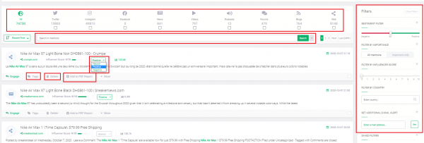
Now, let’s now take a deeper look on the narrative that this platform offers us for the search on #ScholarStrike.
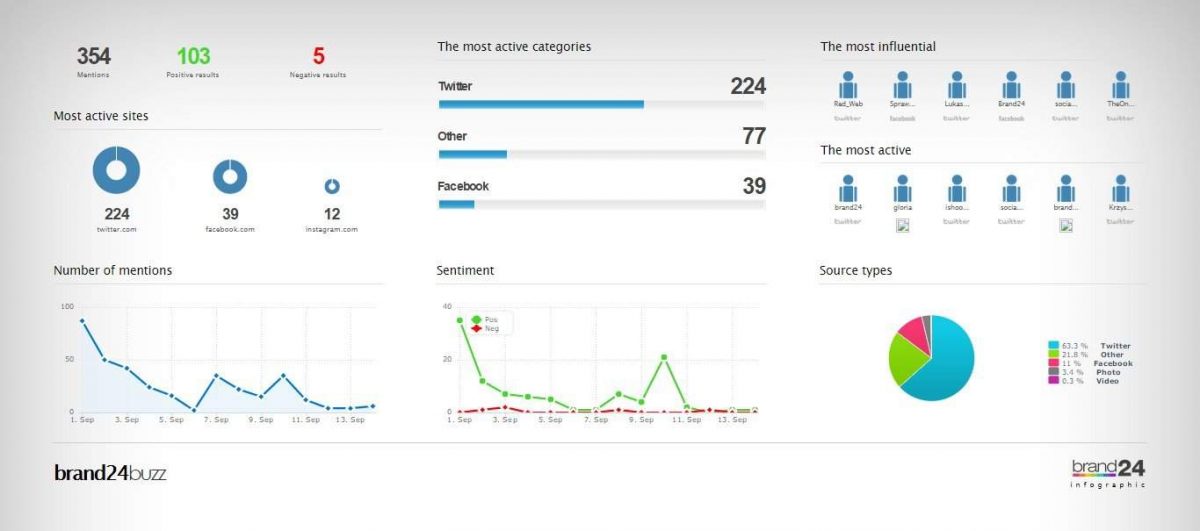
We did the first hashtag search on the 13 and Brand24 did the retrospective search for the last 30 days (Aug 14, 2020 to Sept 13, 2020). 24 hours after setting up the search, it allowed us to download a report and an infographic. In the first report, we can see that, generally, the sentiment about the strike was positive (44 positive against 21 negative):
Figure 3. Summary of #ScholarStrike mentions on social media from Brand24.
Clearly, since #ScholarStrike was an action that lasted just a couple of days, the mentions only occur in that period, but it is remarkable how they grew on the third day after it started:
Figure 4. Graph of the volume of #ScholarStrike mentions on social media throughout the month of September.
Then, the platform gives us a visualization of the most salient terms of all social media.
Figure 5. Set of most salient terms in social media within the context of #ScholarStrike exchange.
Justifiably, professor, teaching, are key terms since the action occurred in that field, but, as we said at the beginning of the post, the intertwine with the Black Lives Matter movement is visible in terms such as racial, issues, September, police, injustice, black. It is interesting, although expected, given its political use, that of the two most popular social network platforms, Facebook and Twitter, it is the second that stands out. Another notable term is Butler. What is interesting here is that, out of context, Butler could be associated with the philosopher and theorist Judith Butler (widely cited based on her thesis on the performativity of gender), who has also had an active intervention in the BlackLivesMatter movement through her publications in different media outlets, and on social media, as shown in these publications: https://opinionator.blogs.nytimes.com/2015/01/12/whats-wrong-with-all-lives-matter/https://iai.tv/articles/speaking-the-change-we-seek-judith-butler-performative-self-auid-1580 . However, this term actually refers to Aethna Butler, professor in Religious Studies and Africana Studies at the University of Pennsylvania, who was one of the organizers of the Scholar Strike: https://www.insightintodiversity.com/professors- lead-a-nationwide-scholar-strike-for-racial-justice /
Next, the platform shows us the most active and the most recent users in terms of their activity on Twitter:
Figure 6. Most popular users and recent mentions in Twitter.
It is difficult to know if the tool is measuring the most popular users by number of Tweets or by retweets. From what can be seen below, it seems that the calculation is made from the mentions and these are the ones that weight the degree of influence of a user on Twitter (figs 7 and 8).
However, something that struck us is the user ISASaxonists, a group of medievalists specialized in Anglo-Saxon medieval literature (fig 6).
Figure 7. Most active public profiles on Twitter related to #ScholarStrike.
Figure 8. Most influential public profiles on Twitter.
Lastly, the platform shows the most used hashtags (and related to each other):
Figure 9. Most mentioned hashtags on Twitter, from the #ScholarStrike search.
#ScholarStrike, #BlackLivesMatter, #Covid are expected hashtags. Once again, the interesting thing here is the medievaltwitter hashtag, in 13th place, which, although the platform does not make it explicit, must be related, for example, to the user ISASaxonists. If this is the case, it would be interesting to think if both the medievaltwitter hashtag and the tweets of the user ISASaxonists are related to the accusations that occurred in 2019 against the Anglo-Saxon International Society for its inability to account for issue of racism, sexism, diversity and inclusion within Ango-Saxon studies. Part of this discussion was published in academic journals in the U.S during September 2019: https://www.insidehighered.com/news/2019/09/20/anglo-saxon-studies-group-says-it-will-change-its-name-amid-bigger-complaints-about
Overall, exploring the context of ScholarStrike with the Brand24 platform allowed us to confirm some previous assumptions (its relationship with hashtags such as BLM, Covid) but it also illuminated less expected other hashtags for a non-academic user, such as #medievaltwitter, and other hashtags that subtly appeared in the beginning, but soon began to have more impact in the following weeks, in the midst of the electoral race, such as #bidenharris2020.
Gimena del Rio/Marisol Fila
